Hi All,
Today I’m sharing few of the amazing features coming with the new Microsoft Power BI.
It’s a public preview, that means you can just sign up and start using…
Link for the public preview: Click here

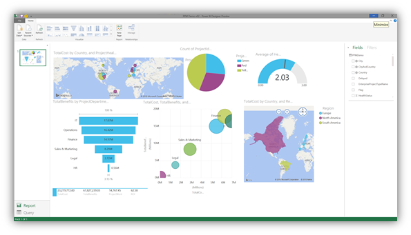
So, I will start our tour by showing the new Microsoft Power BI Designer.
You can download it here.
This tool will provide your analysts to discover, combine and visualize data.

It has several built in connectors to help you out on getting data from anywhere.

It is a combination between Power View and Power Query, which I love it!

The extension being used is also new, “.pbix”

This is not a tutorial, but only a tour around the new Microsoft Power BI… Tutorials will come soon…
Take a look at the interface and how it’s cool to move between dashboards:

It’s possible to create dashboards just by asking a question and, if the result is interesting, pin it! It’s so easy and fun to build dashboards like that… trust me…

After pinned many charts or tables, you can now arrange and resize them… creating a super nice look and feel:

You can also pin a chart to a dashboard based on an existing report… by doing that, if you click on the chart/table/map the actual report will be opened for detailed analysis…

Another nice thing is that now we can get data directly from Power BI without any other tool… just by using your browser…
But if you want, you can also upload existing Excel files or new Power BI Dashboards created using the Power BI Dashboard Desginer.

Another great improvement is the Q&A engine… now, it’s much more integrated and easier to use.
You can just start typing a question and Power BI will identify what are you talking about and bring the right data to you.
Even more, according to your question and data that you asking for, Power BI also combine this data and generates charts, tables or maps LIVE…
It’s so fast that sometimes looks like the chart is generated before you even type! J

Hope you have enjoyed knowing a little bit more about this amazing tool!
See you!
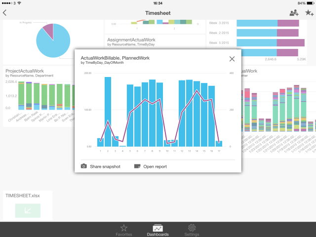
Ops!!! Almost forgot… You can also access all of this using your table or cellphone… Look below how it is the interface using the iPad app:
In the front page you can see all available dashboards:

By clicking on one of them, you will open to explore, which also looks amazing…


If you want to see details of an specific chart, just click on it:

To see the report which this chart belongs, just click on “Open Report” and the entire report will open to you.

The charts are interactive and super nice to use it… you can even share by email


bye!

Comments