Power BI Custom Visuals are amazing and give us an unlimited amount of possibilities to analyze data!
I will try to make a series of posts where I can show how to use each of them on different scenarios…
You can download it here: https://app.powerbi.com/visuals/
Then click on Sankey with Labels
![](https://static.wixstatic.com/media/db3ec0_70719ccc7d90438bba90a26d59eb8bae~mv2.png/v1/fill/w_980,h_504,al_c,q_90,usm_0.66_1.00_0.01,enc_auto/db3ec0_70719ccc7d90438bba90a26d59eb8bae~mv2.png)
A popup window will show details of the custom visual
Click on Download Visual
![](https://static.wixstatic.com/media/db3ec0_99fc2a8e2e764e0b90546f6a17b51e0f~mv2.png/v1/fill/w_980,h_494,al_c,q_90,usm_0.66_1.00_0.01,enc_auto/db3ec0_99fc2a8e2e764e0b90546f6a17b51e0f~mv2.png)
Save the .pbivix file to your computer
Import the file to your Power BI Desktop or Power BI Report
In case you don’t know how to import it, there is a step by step here: Using Power BI Custom Visuals with Project Online to show Resource Engagements Data
![](https://static.wixstatic.com/media/db3ec0_5853f9acc9874d8383a788c4dece5216~mv2.png/v1/fill/w_980,h_402,al_c,q_90,usm_0.66_1.00_0.01,enc_auto/db3ec0_5853f9acc9874d8383a788c4dece5216~mv2.png)
This custom visual works with Source, Target and a Value.
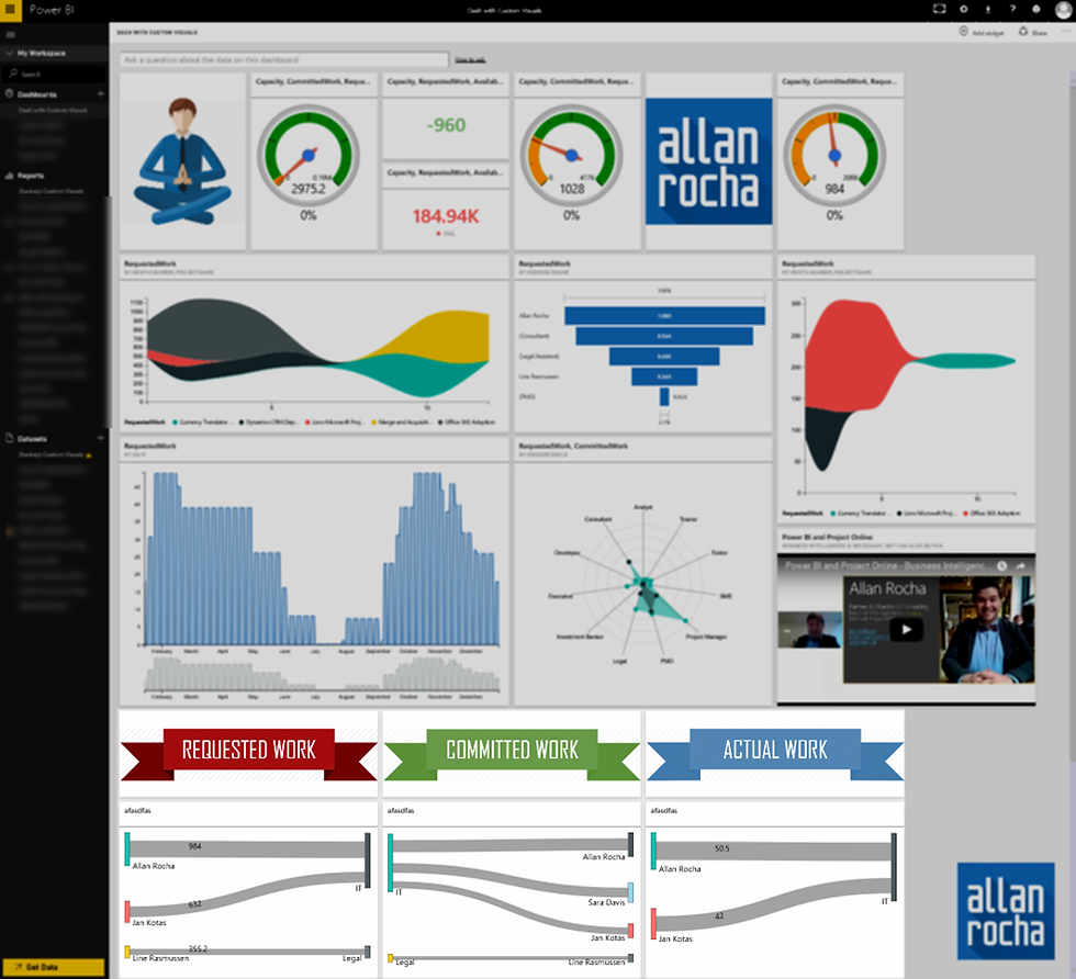
See in the picture below how cool they are presented:
Note that the thickness of the pipe/line is according to your Value data.
![](https://static.wixstatic.com/media/db3ec0_f6442c483645451b9dae50eb3ba3f439~mv2.png/v1/fill/w_980,h_535,al_c,q_90,usm_0.66_1.00_0.01,enc_auto/db3ec0_f6442c483645451b9dae50eb3ba3f439~mv2.png)
Play around with some other Values…
Some other Sources and Targets and there is a cool result! J
![](https://static.wixstatic.com/media/db3ec0_493a0f89f8c94375a262b32deca48229~mv2.png/v1/fill/w_980,h_535,al_c,q_90,usm_0.66_1.00_0.01,enc_auto/db3ec0_493a0f89f8c94375a262b32deca48229~mv2.png)
Publish or upload your Report to Power BI
![](https://static.wixstatic.com/media/db3ec0_507794015513420e860cef6254fe51bd~mv2.png/v1/fill/w_980,h_494,al_c,q_90,usm_0.66_1.00_0.01,enc_auto/db3ec0_507794015513420e860cef6254fe51bd~mv2.png)
When access for the 1st time remember to Enable Custom Visusals
![](https://static.wixstatic.com/media/db3ec0_9676ff0046fa4b3b92934ab5cc1ac0d3~mv2.png/v1/fill/w_980,h_494,al_c,q_90,usm_0.66_1.00_0.01,enc_auto/db3ec0_9676ff0046fa4b3b92934ab5cc1ac0d3~mv2.png)
That’s it!
Your report is done and you can enjoy your beautiful data anywhere.
![](https://static.wixstatic.com/media/db3ec0_7d2ac83070a44f4ea642335fc11081d8~mv2.png/v1/fill/w_980,h_495,al_c,q_90,usm_0.66_1.00_0.01,enc_auto/db3ec0_7d2ac83070a44f4ea642335fc11081d8~mv2.png)
You can always add some slicers to narrow down your data
![](https://static.wixstatic.com/media/db3ec0_38915f8553ee4132b10ef337543951e6~mv2.png/v1/fill/w_980,h_495,al_c,q_90,usm_0.66_1.00_0.01,enc_auto/db3ec0_38915f8553ee4132b10ef337543951e6~mv2.png)
Not ending here…
You can even pin these charts to your dashboards making them ALIVE for every time you need your data!
![](https://static.wixstatic.com/media/db3ec0_6942c38fa139494b98e45d6bd5e9bec2~mv2.png/v1/fill/w_980,h_495,al_c,q_90,usm_0.66_1.00_0.01,enc_auto/db3ec0_6942c38fa139494b98e45d6bd5e9bec2~mv2.png)
![](https://static.wixstatic.com/media/db3ec0_d86be87a2daf42aa899bca640a82e928~mv2.png/v1/fill/w_980,h_892,al_c,q_90,usm_0.66_1.00_0.01,enc_auto/db3ec0_d86be87a2daf42aa899bca640a82e928~mv2.png)
Don’t forget to try it on your mobile phone or tablet
![](https://static.wixstatic.com/media/db3ec0_5a2ed73c0c6044a888c35db08571e582~mv2.png/v1/fill/w_980,h_560,al_c,q_90,usm_0.66_1.00_0.01,enc_auto/db3ec0_5a2ed73c0c6044a888c35db08571e582~mv2.png)
Comments